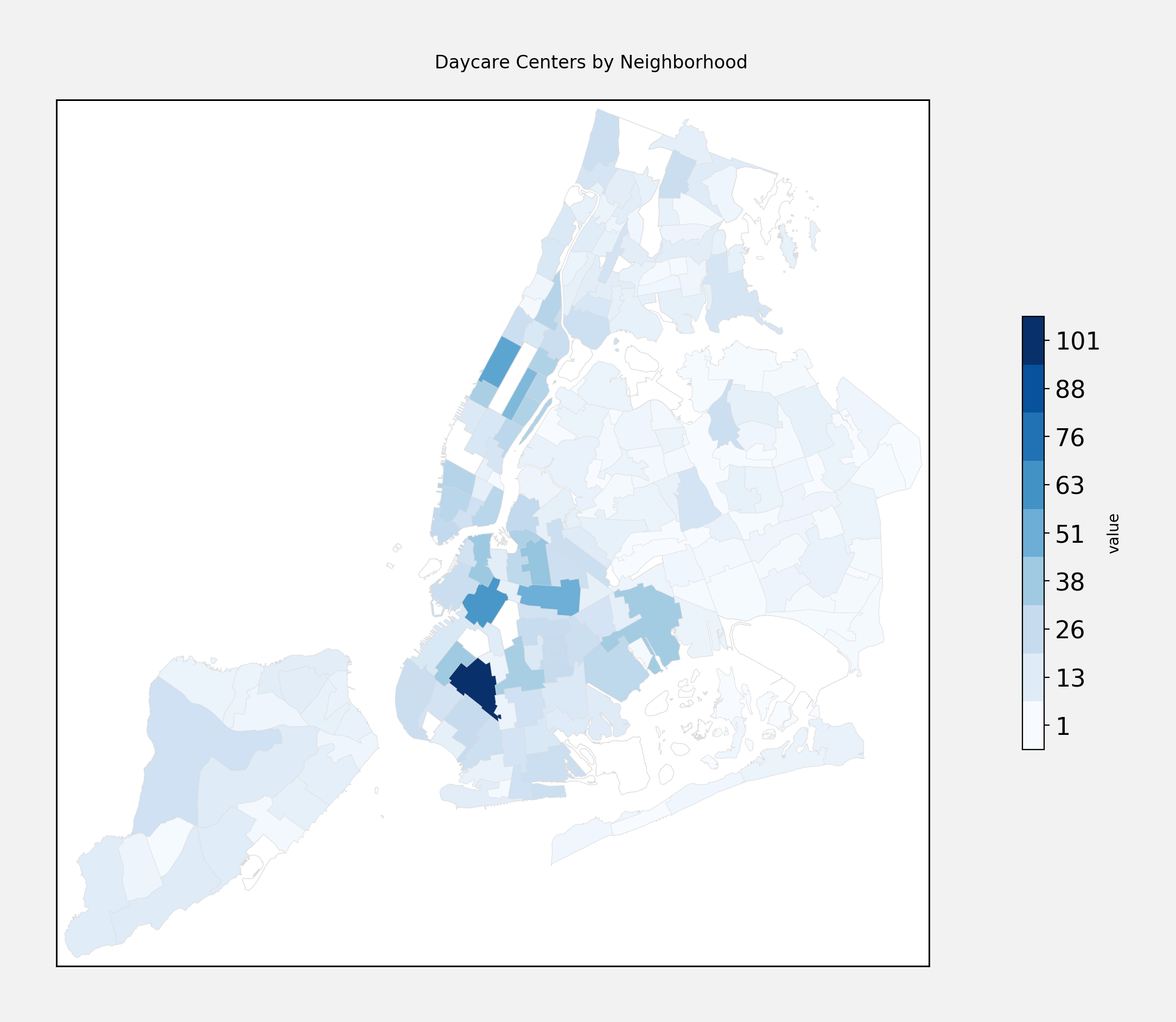
According to OpenData’s daycare inspection dataset, there are 2,948 daycare providers in NYC. That includes infant daycares, school based programs, and camps. Brooklyn has the lionshare of daycare centers - 1,255, or roughly 43% of all the daycare centers, with Manhattan coming in second (732, or 24%), and The Bronx third (430, or 14%).
Here is how the daycare centers are distributed around the city:
What is the best neighborhood to have a new baby in?
If you are interested in daycare, then it looks like you should be headed to Dumbo. The top five neighborhoods for the availability of infant daycare, controlling for population, are:
| Neighborhood | People per Infant Daycare |
|---|---|
| DUMBO-Vinegar Hill-Downtown Brooklyn-Boerum Hill | 3450 |
| Midtown-Midtown South | 4090 |
| Battery Park City-Lower Manhattan | 4411 |
| Prospect Heights | 4962 |
| Clinton Hill | 4970 |
This mostly correlates with stroller sightings around those neighborhoods (though Midtown, really?).
Where to go to camp?
Not surprisingly, camps look to be clustered around parks. The top neighborhoods with camps are:
| Neighborhood | Number of Camps |
|---|---|
| Park Slope-Gowanus | 24 |
| East New York | 12 |
| Upper East Side-Carnegie Hill | 11 |
| East Harlem South | 11 |
| Central Harlem North-Polo Grounds | 11 |
Park Slope has double the next most, but if you have visited Prospect Park in the summer this will not surprise you.
Where should there by more daycare centers?
Here is the plot of daycare centers throughout the city, controlling for population:
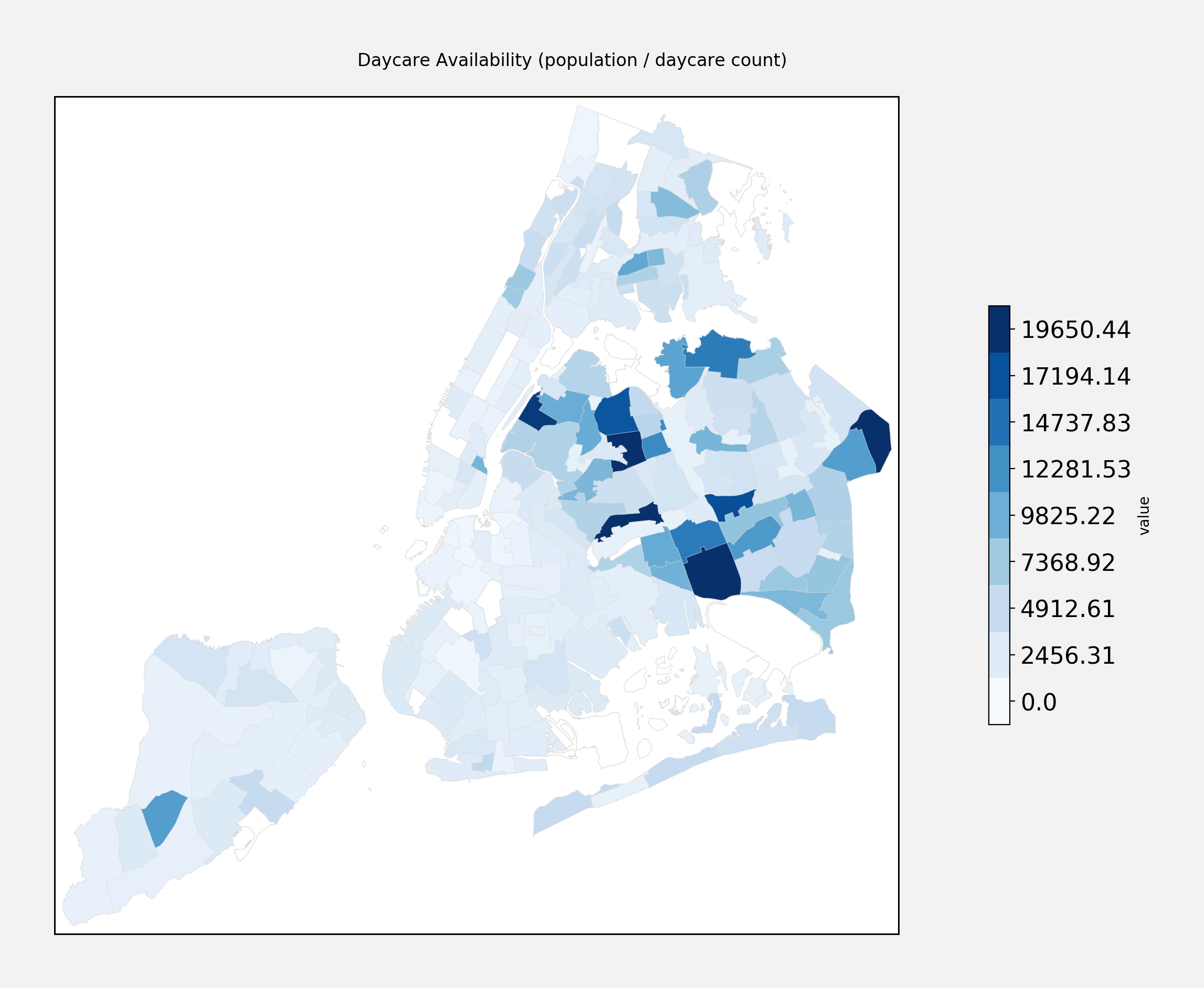
Notice anything? Looks like Queens is the outlier. Either there is a massive shortage of daycare centers in Queens, or daycare centers there are systemically under reported.
If we remove Queens from the data, the distribution looks more like this:
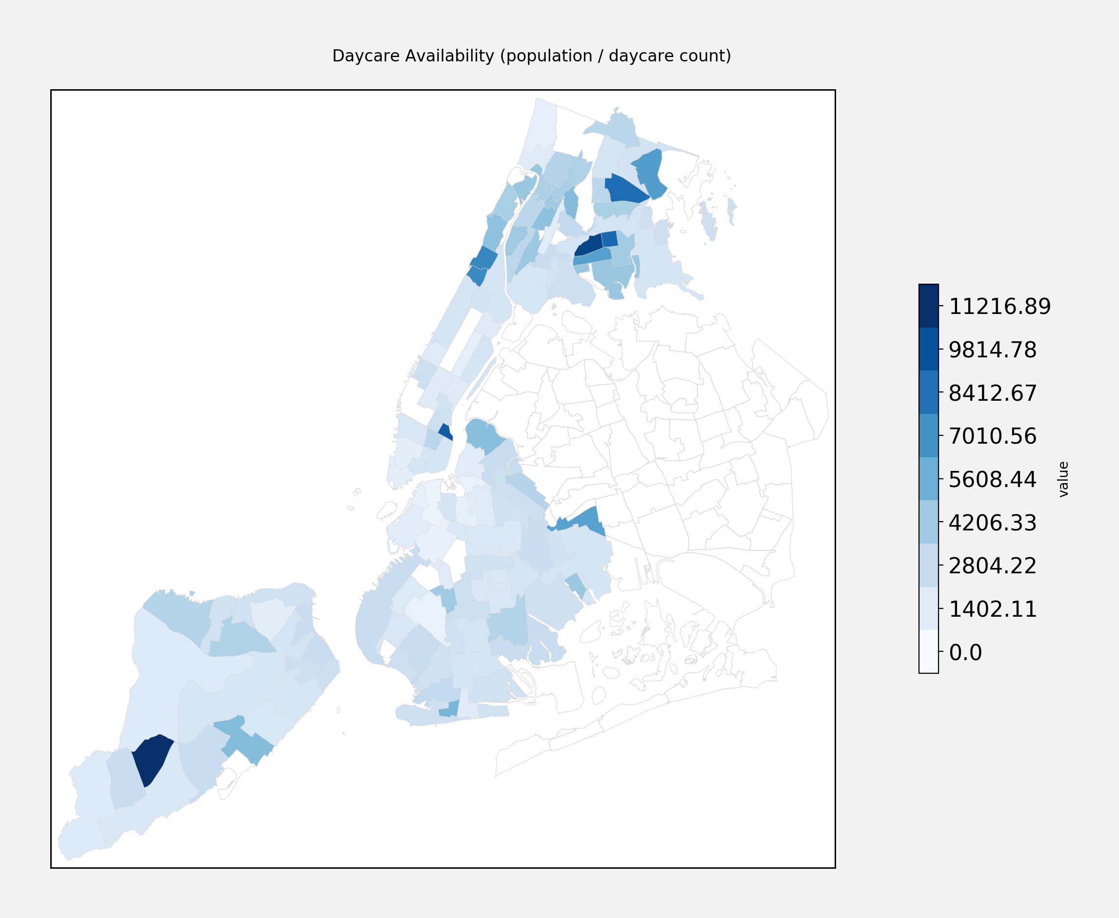
Looks like the neighborhoods with the lowest concentration of daycare centers are mostly in the Bronx. Here are the top five:
| Neighborhood | Borough | People per Daycare |
|---|---|---|
| Arden Heights | Staten Island | 12619 |
| West Farms-Bronx River | The Bronx | 11670 |
| Stuyvesant Town-Cooper Village | Manhattan | 10525 |
| Parkchester | The Bronx | 9940 |
| Allerton-Pelham Gardens | The Bronx | 9634 |
Presumably StuyTown is because of the high concentration of residential within that neighborhood. Still, the surrounding areas do not make up for it - perhaps a good place to start a daycare center?