One of the datasets available on the amazing NYC bike data website (available here) is information on accident rates, sorted by police precinct and accident type. They make this information available in the dreaded PDF format, and it took me a little while to get over this, however with the help of Tabula I was able to convert the PDFs into something useful.
There are four different types of crashes, defined by what the bike crashes into: car, pedestrian, themselves, and other bikes. Presumably “themselves” encompasses a miscellaneous assortment of tragic collisions, including street poles, pot holes, and the occasional spontaneous combustion.
In 2015 there were 5270 crashes reported, with collisions between cars and bikes being by far the most representative with 83.7% of all accidents. I imagine there is a reporting bias here, in that these types of collisions are more likely to get picked in a police report than other types. Car collisions are followed by self collisions (8%), pedestrian collisions (6.6%), and lastly collisions with other bikes (1.7%). It is interesting to speculate why car crashes have such a higher representation - as a cyclist in NYC I would apriori expect pedestrian crash rates to be about as high if not higher - but I do not see a clear reason in the data.
One might think car crashes are reported more is because of more damage (both in terms of property damage and personal injury). We cannot judge property damage rates from the data, however the dataset does contain injury rates. They are all pretty close - with a car, 50% of the time the bicyclist is injured, with another bike 45%, themselves 42%, and with pedestrians only 4% (although pedestrians suffer some sort of injury in those accidents at a high rate - 52% of the time). So it is unclear why bike on car crashes are so highly represented, unless it is just the reality. What is perhaps more clear is that as expected, in asymmetical exchanges, the lower mass/more vulnerable median is more likely to get hurt (between bike and car, it is 0.6% for car vs 50% for bike, and between bike and pedestria it is 4% for bike and 52% for pedestrian).
Since this data is indexed by police precinct, it is possible to plot accident rates by geographic area. Below is a plot of bike accidents with cars in 2015, with accident rates normalized by the 2010 census population in each precinct.
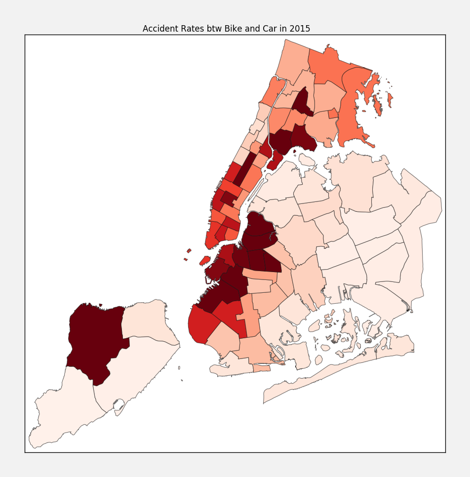
It is a little disheartening to note that my normal commute crosses almost all of the most dangerous precincts. Oh well…
Methodology
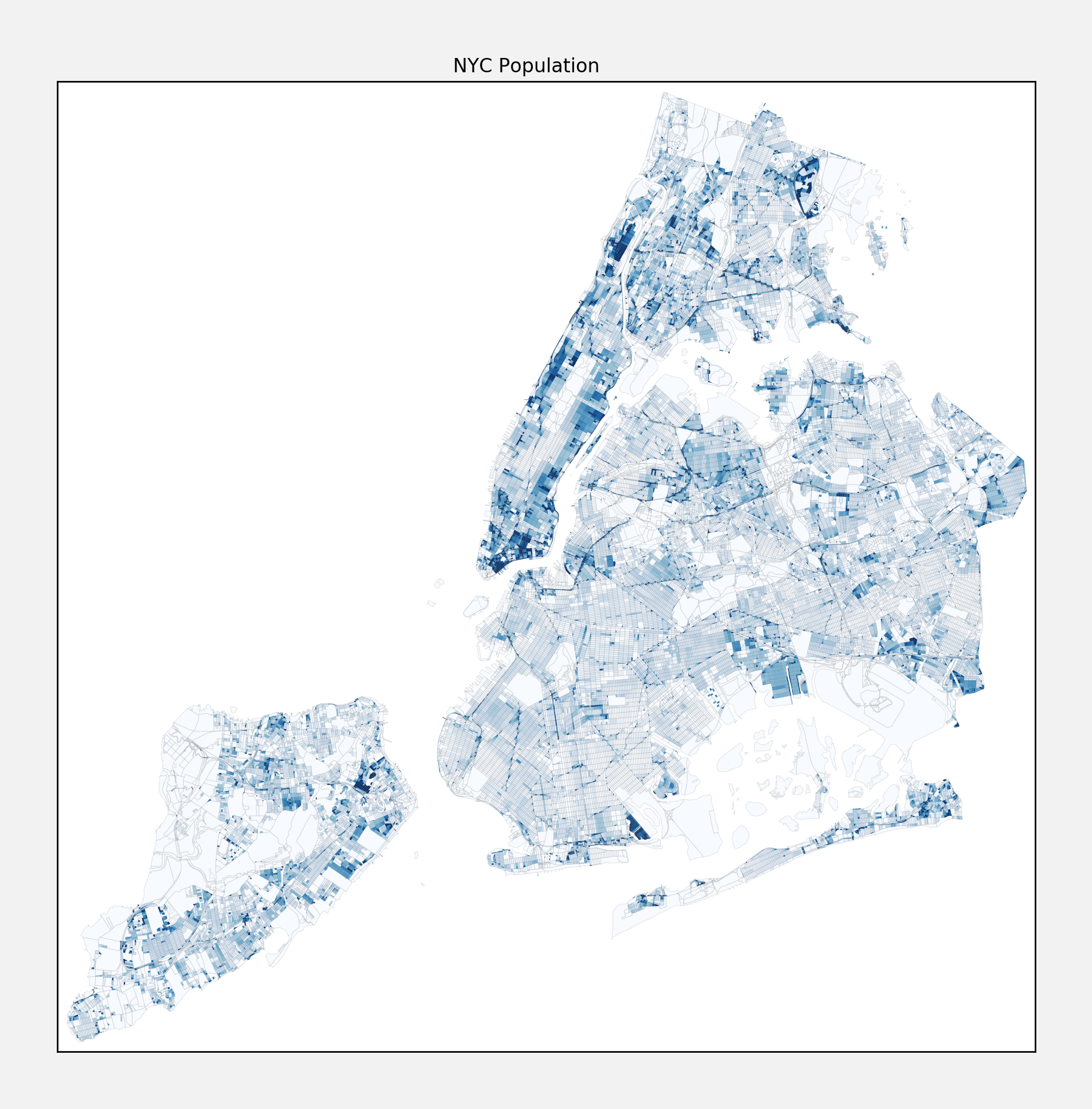
The plots in this writeup are done using the basemap package from matplotlib, and a helpful tutorial here. NYC provides the data on collisions rates here. NYC also provides all sorts of useful information by census tract, including population, here. Since the collision rates are reported by precinct and the population is by tract, you need a way to translate census tract into police precincts, for which I found a static mapping that you can pull down here.