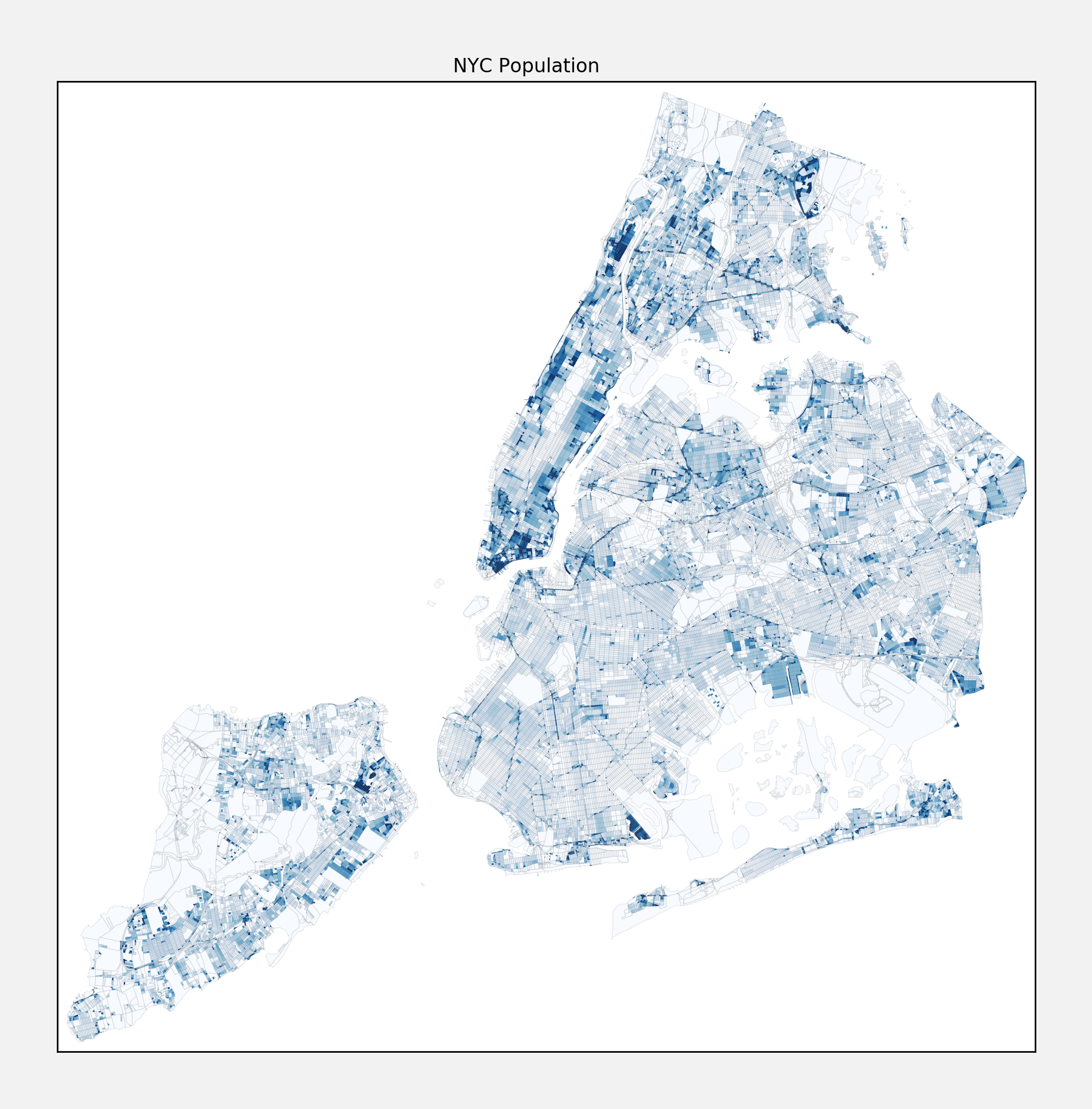
Take a look a look at this map of NYC population density, based on the 2010 census:

As you might expect? Looking at that map forced me to invalidate some of my previously held assumptions about NYC neighborhoods. I knew that Manhattan was likely to be the densist borough overall, however I did not realize how much more dense it is than Brooklyn! In fact, based on this map, it appears that Brooklyn is a lot less dense than most of Queens, Staten Island, and certainly the Bronx. That was a big surprise to me.
I was also confounded by the dense cluster in the north east corner of the Bronx. At first I figured this was just a fluke, but I investigated separately here and here. It appears that this census tract (tract 046201) has a very high population count, about 60% more than anything else. I am not sure what that means, but it gives me a little pause since it is such a statistical outlier when it comes to the other tracts in NYC (much less in the rest of the country).
Methodology
The plots in this writeup are done using the basemap package from matplotlib, and a helpful tutorial here. NYC provides useful shapefiles for all of its census tracts, those can be found here, and you can also pull down the population data. In order to get reasonable midrange differentiation, I winsorized the population density (seemed better than mapping it to a logarithmic scale, since the data is visualized with a linear color scale). But to each his own.
nyc opendata