There is a pretty fabulous dataset offered up through NYC’s 311 service. 311 is a service started in NYC in 2003 to provide a consolidated end point for non-emergency municipal services. 311 is offered in many other cities around the world. Noise complaints, trash removal, and towing requests and all examples of requests you might file through 311. NYC offers up an anonymized near realtime log of all requests filed through 311, which furthermore includes historical records going back to its inception. The records are surprisingly rich, beyond the basic details of the request and which department handled it, they contain the timing of when it was opened and closed, free form comments, and most records have some notion of location attached to them. I attempted to use the request type and location to answer this question: Can we differentiate NYC neighborhoods based on the types of requests that are filed within them?
Results
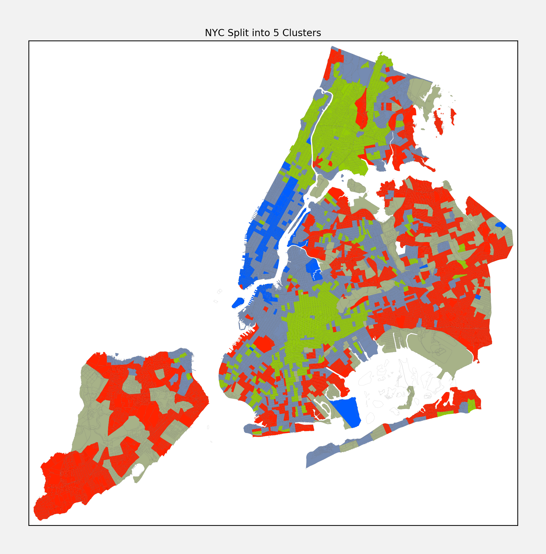
I ran a clustering algorithm over the request types, broken down into census tracts, and came up with the following map:
Note, the fact the clusters are geographically consolidated makes sense but was not part of the clustering algorithm formulation. The clustering only applied to the profile of request types in each tract, and naturally you would expect nearby tracts to have similar issues, but the extent to which this is the case is enlightening in its own right. As for what types of requests differentiate each cluster, here is a summary for each:
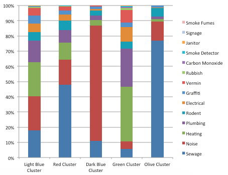
- Light Blue: Pretty evenly split between sewage, noise, heating, and plumbing issues
- Red: Almost half of the issues are sewage related, then a pretty split distribution
- Dark Blue: Noisy area - 76% of issues are noise related
- Green: Housing issues like heating and plumbing are dominate
- Olive: 77% of issues relate to sewage
Here is a little more detail on the distribution of issue types in each cluster. This distribution is the centroid of the cluster, measured using a median amongst the constituent census tracts and then normalized to 100%. There are almost 300 different issue types, so I bucketed some similar complaints and filtered to the most popular issues here:
Analysis
It is tough to look at the map and not see some familiar patterns. Take Manhattan for instance - it is divided into three clusters. One (in light blue) is sort of a blend of a lot of different issues with no one issue dominating. The area it covers loosely aligns with the residential areas of Manhattan. The second (in dark blue) is the noisy area, which covers a lot of the business and most traffic congested areas. And finally there is the area that appears to have a lot of housing issues (green), that roughly lines up with Harlem. The way the issues line up with the geography is telling of what separates Harlem from the rest of Manhattan. And if you look closely, you can see that there are areas of light blue permeating into the southern border of Harlem, perhaps a sign of the changing neighborhood.
The other boros are more of a mixed bag. The bronx shares much of the same character as Harlem, where housing issues dominating. Queens and Staten Island appear to be somewhat similar in their issue types, and unfortunately they appear to have the most issues with sewage. I hate to say it, being a former Queens resident, but the data suggests it is in the running to be the smelly boro.
Not surprisingly Brooklyn looks pretty diverse, as measured by different distributions of issue types. Downtown Brooklyn is much like the noisy areas of Manhattan, and the expensive rent areas like Williamsburg, Park Slope, and Cobble Hill look a lot like lower Manhattan. Bed Stuy, Crown Heights, and Flatbush have much of the same issues as Harlem and the Bronx. Interestingly, the further south you go in Brooklyn the more “block by block” it appears to become - with a lot more fragmentation in the types of issues you see in nearby geographic areas.
Further Reading
Here is an interesting paper that profiles other aspects of NYC’s 311 data: paper
Methodology
The 311 data is big and dense, so it took a little processing to get to this analysis. A couple of notes on the methodology present here:
- About half of the 13M records had lat/long coordinates, which I processed through this api in order to convert them into census blocks. I chose to summarize on the census tract level though, as it provided a more statistically signigicant binning of requests.
- To compute the clusters, I first computed the by tract distribution of request types, filtering out outliers in the distribution. Then I computed a similarity matrix over the census tract, where the distance score between any two tracts was the euclidean distance of their issue distributions. In other words, if one tract had 50% noise complains and 50% heating issues, and another had 20% noise complaints and 80% heating, the distance I used was sqrt( (50% - 20%)^2 + (50% - 80%)^2 ).
- The actual clustering algorithm used with an aggolmerative approach using wards method. I computed clusters at varying levels, from 2 to 15 different clusters, but got the most stable results at 5, which is what I reported here.
- The cluster centroids were computed using a median of the underlying tract constituents distributions. Average reported similar results.
- Props to digital ocean for making it cheap/easy to spin up temporary compute resources.
There is a lot more detailed data that I generated in the course of this analysis. If you want access to any of it, feel free to contact me (my information is in the about page).
nyc 311 cluster opendata
